


Using color combinations
kimcoco
15 years ago
Related Stories

COLOR PALETTESCombine Black and Pastels for a Fresh New Look
Take the sweetness out of sugary shades by adding striking black accents. Here's how to do it and why it works
Full Story
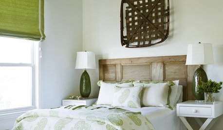
GREENColor Combinations: Brown and Green
Take Your Cue from Nature for the Most Classic Color Combination of All
Full Story
GREENFavorite Color Combinations: Celery and Chocolate
Accent your space with a delicious mix of light green and dark brown
Full Story
DECORATING GUIDESHow to Combine Area Rugs in an Open Floor Plan
Carpets can artfully define spaces and distinguish functions in a wide-open room — if you know how to avoid the dreaded clash
Full Story
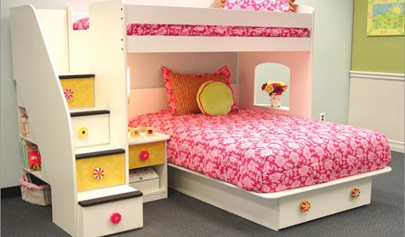
DECORATING GUIDES7 Tips to Combine a Playroom and Guest Room
Nurture ABC fun by day and 'Zzzzz' at night with these ideas that cater to both kids and overnight guests
Full Story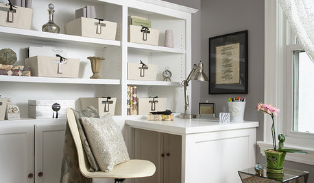
MEDIA ROOMS9 Tips to Combine a Home Office and TV Den
Split personalities can work well together if you set your room up with the right storage, layout and lighting
Full Story
HOUZZ TOURSMy Houzz: Loft-Style Home Combines Business With Pleasure
A New Zealand couple create a custom-designed home to suit their social lifestyle and love of art
Full StoryMore Discussions

gardengirl_17
opheliathornvt zone 5
Related Professionals
Baltimore Landscape Architects & Landscape Designers · Bellflower Landscape Architects & Landscape Designers · Forest Park Landscape Architects & Landscape Designers · South Elgin Landscape Architects & Landscape Designers · Wareham Landscape Architects & Landscape Designers · Goodyear Landscape Contractors · Waterbury Landscape Contractors · Alamo Landscape Contractors · Bell Gardens Landscape Contractors · Euclid Landscape Contractors · Metairie Landscape Contractors · Midland Landscape Contractors · Mount Kisco Landscape Contractors · Ramsey Landscape Contractors · Riverview Landscape Contractorsgardengal48 (PNW Z8/9)
nckvilledudes
kimcocoOriginal Author
jeanne_texas
angelcub
buyorsell888
opheliathornvt zone 5
botanybabe
tracyvine
botanybabe