


what does a bad combination look like?
motria
20 years ago
Sort by:Oldest
Comments (25)
Related Stories

INSIDE HOUZZHow Much Does a Remodel Cost, and How Long Does It Take?
The 2016 Houzz & Home survey asked 120,000 Houzzers about their renovation projects. Here’s what they said
Full Story
REMODELING GUIDESBathroom Workbook: How Much Does a Bathroom Remodel Cost?
Learn what features to expect for $3,000 to $100,000-plus, to help you plan your bathroom remodel
Full Story
HOUZZ TOURSHouzz Tour: Istanbul Apartment Does a Double Take
Two apartments and two contrasting design styles combine in a single stunning home with a view in Turkey
Full Story
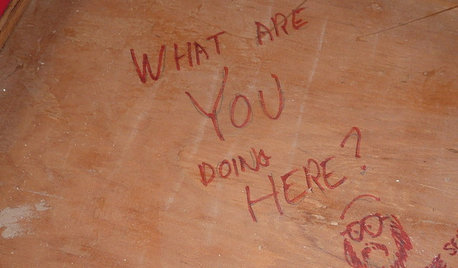
FUN HOUZZDoes Your Home Have a Hidden Message?
If you have ever left or found a message during a construction project, we want to see it!
Full Story
MOST POPULARWhen Does a House Become a Home?
Getting settled can take more than arranging all your stuff. Discover how to make a real connection with where you live
Full Story
HOME TECHDoes Your Home Need an Operating System?
New technologies hope to unify the lawless frontier of home-automation products. Would they work for you?
Full Story
ARCHITECTURERoots of Style: Does Your House Have a Medieval Heritage?
Look to the Middle Ages to find where your home's steeply pitched roof, gables and more began
Full Story
FUN HOUZZ10 Truly Irritating Things Your Partner Does in the Kitchen
Dirty dishes, food scraps in the sink — will the madness ever stop?
Full Story
LANDSCAPE DESIGNDoes Your Landscape Need a Little ‘Cosmic Latte’?
Beige — the color of the universe — can be both building block and backdrop in a contemporary garden
Full Story
GreenKnees2
motriaOriginal Author
Related Professionals
Zion Landscape Architects & Landscape Designers · Hartford Landscape Contractors · Waterbury Landscape Contractors · Duarte Landscape Contractors · Ellicott City Landscape Contractors · Fort Mill Landscape Contractors · Fuquay-Varina Landscape Contractors · Lyndhurst Landscape Contractors · Seymour Landscape Contractors · Shenandoah Landscape Contractors · Shafter Landscape Contractors · Browns Mills General Contractors · Los Lunas General Contractors · Oxon Hill General Contractors · Woodmere General Contractorselise_w
Wandane
motriaOriginal Author
shelley_r
flowersandthings
motriaOriginal Author
Frizzle
sugarhill
lapageria
susanzone5 (NY)
numbnerve
flowersandthings
Dieter2NC
madsud
Ina Plassa_travis
madsud
ccdry
Scottymamof2
stellagord
mla2ofus
sqlguy
garden_fever_girl
Brent_In_NoVA