


assignment #3
valleyrimgirl
16 years ago


Related Stories
TRANSITIONAL HOMESHouzz Tour: New Homeowners Find Their Style
Homework assignments help reveal a couple’s tastes and lead to a home filled with textures and organic tones
Full Story
STUDIOS AND WORKSHOPS6 Tips to Combine a Crafts and Homework Room
You and the kids can both be productive, with a high-performing space that encourages crafting inspiration and school assignment finishing
Full Story
WORKING WITH AN ARCHITECTWho Needs 3D Design? 5 Reasons You Do
Whether you're remodeling or building new, 3D renderings can help you save money and get exactly what you want on your home project
Full Story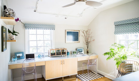
HOME OFFICESNew This Week: 3 Home Offices That Know How to Work It
We look at the designers’ secrets, ‘uh-oh’ moments and nitty-gritty details of 3 great home offices uploaded to Houzz this week
Full Story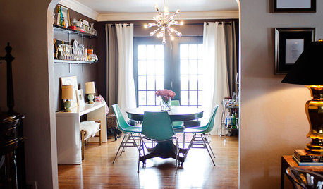
LIFESo You're Moving In Together: 3 Things to Do First
Before you pick a new place with your honey, plan and prepare to make the experience sweet
Full Story
ECLECTIC HOMESHouzz Tour: Rebooting a 1930s Bungalow in 3 Days
A design team mixes old and new to upgrade a computer science teacher's home in a flash
Full Story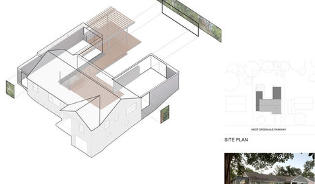
DESIGN PRACTICEDesign Practice: How to Pick the Right Drawing Software
Learn about 2D and 3D drawing tools, including pros, cons and pricing — and what to do if you’re on the fence
Full Story
HOME TECHUnlock Your Smart Phone's Front-Door Powers
Take your locks and keys into the digital age with 3 solutions that put convenience and new capabilities on your doorstep
Full Story
HOLIDAYS11 Survival Lessons From Thanksgiving
With 10 people in 1 house for 3 days, you learn fast. Find out the good, the challenging and the just plain kooky
Full Story
ORGANIZINGGet It Done: Organize Your Kitchen Cabinets
You deserve better than precarious piles of pots and toppling towers of lids. Give cabinet chaos the boot with these organizing strategies
Full StoryMore Discussions
xtreme_gardener
valleyrimgirlOriginal Author
Related Professionals
Kyle Landscape Architects & Landscape Designers · Middle Island Landscape Architects & Landscape Designers · Edmond Landscape Contractors · Williamsburg Landscape Contractors · Edinburg Landscape Contractors · Fairview Landscape Contractors · New Brighton Landscape Contractors · New Cassel Landscape Contractors · Overland Park Landscape Contractors · 45056 Window Contractors · Bay Point Window Contractors · DeLand Window Contractors · Orange County Window Contractors · Pedley Window Contractors · Yeadon Window Contractorsxtreme_gardener
cailinriley
sierra_z2b
marciaz3 Tropical 3 Northwestern Ontario
sierra_z2b
valleyrimgirlOriginal Author
sierra_z2b
xtreme_gardener
north53 Z2b MB
sierra_z2b
savona
north53 Z2b MB
sierra_z2b
marciaz3 Tropical 3 Northwestern Ontario
savona