


Whoa!
tepelus
11 years ago
Related Stories
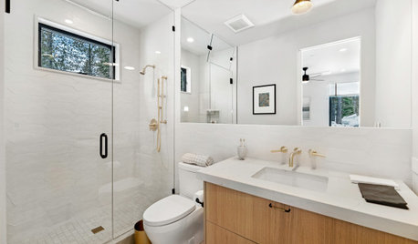
BATHROOM DESIGNKey Measurements to Make the Most of Your Bathroom
Fit everything comfortably in a small or medium-size bath by knowing standard dimensions for fixtures and clearances
Full Story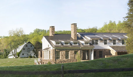
FARMHOUSESHouzz Tour: An Old Barn Inspires a Gracious New Home
Graceful and elegant, this spacious home in the Virginia countryside takes farmhouse style up a notch
Full Story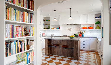
HOUZZ TOURSHouzz Tour: Better Flow for a Los Angeles Bungalow
Goodbye, confusing layout and cramped kitchen. Hello, new entryway and expansive cooking space
Full Story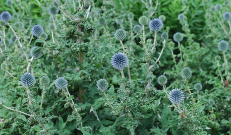
GARDENING GUIDESGreat Design Plant: Globe Thistle
Trot out globe thistle in a sun-drenched garden spot for strikingly sculptural blue flowers through October
Full Story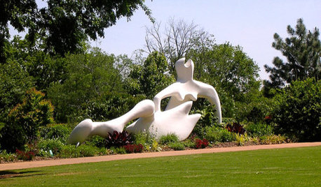
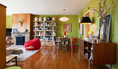
HOUZZ TOURSHouzz Tour: Bringing Out the Midcentury in San Francisco
Renters give their 1950s apartment loads of personal style with color, pattern and a rediscovered wood floor
Full Story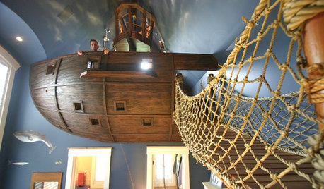
FEEL-GOOD HOMEHouzz Tour: 'Pirate House' Lures With Surprises
Batten down the hatches for a wild ride in Minnesota, from a lofty crow's nest to a twisty, tubular slide to a secret passageway and more
Full Story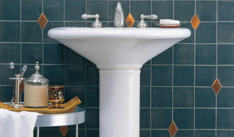
ACCESSORIESFinish Your Look With a Fun Mix of Textiles
Why box yourself into a design corner when you can spread out ever-changing throws, rugs and even bags?
Full StorySponsored
Central Ohio's Trusted Home Remodeler Specializing in Kitchens & Baths
More Discussions

don_in_colorado
ctopher_mi
Related Professionals
Eden Prairie Landscape Architects & Landscape Designers · Marina Landscape Architects & Landscape Designers · Edmond Landscape Contractors · Cambridge Landscape Contractors · Edwardsville Landscape Contractors · Milton Landscape Contractors · Munster Landscape Contractors · Palatine Landscape Contractors · The Villages Landscape Contractors · Tuscaloosa Landscape Contractors · Roy Driveway Installation & Maintenance · North Miami Beach Fence Contractors · Tempe Fence Contractors · Troutdale Fence Contractors · Whittier Fence Contractorsninamarie
mctavish6
paul_in_mn
mctavish6
hostafreak
Babka NorCal 9b
mosswitch
Steve Massachusetts
oliveoyl3
in ny zone5
almosthooked zone5
hostaholic2 z 4, MN
don_in_colorado
User
in ny zone5
gogirlterri
mosswitch
mctavish6
almosthooked zone5
TheHostaCottage
squirejohn zone4 VT