


Here are possible logos for imaginary garden center
esther_b
9 years ago
Related Stories
MOST POPULARSpring Gardens Are Blooming — Here’s What to Do in April
Get the guide you need for gardening in your U.S. region, with tasks, climate-appropriate plantings and more
Full Story
ARCHITECTUREHouzz Call: Show Us Your Logo!
A picture is worth a thousand words, but your company’s symbol may be worth its weight in gold. We’d like to hear the graphic details
Full Story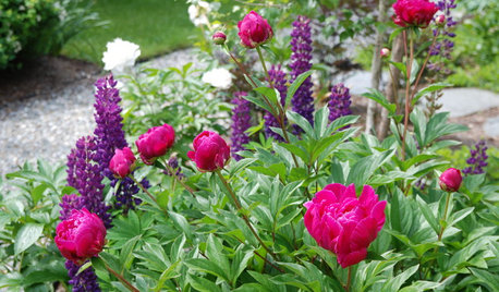
REGIONAL GARDEN GUIDESDelight in Summer’s Garden Glories — Here’s What to Do in June
Wherever you live in the United States, these guides can help you make the most of your summer garden
Full Story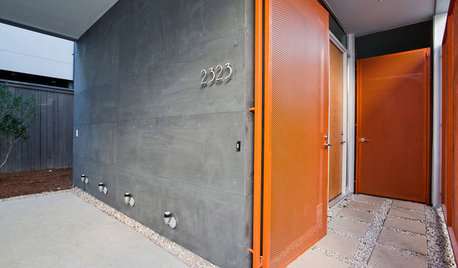
FRONT DOOR COLORSFront and Center Color: When to Paint Your Door Orange
Bring high energy and spirit to your home's entryway with a vibrant shade of orange on the front door
Full Story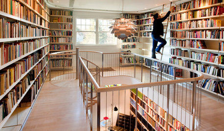
DENS AND LIBRARIESThese Rooms Put the Allure of Books Front and Center
Immerse yourself in a collection of book-filled rooms that indulge a passion for the printed page
Full Story
GREAT HOME PROJECTSConsidering Wallpaper? Here's How to Get Started
New project for a new year: Give your room a whole new look with the color, pattern and texture of a wall covering
Full Story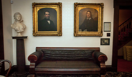
FURNITUREAbraham Lincoln Sat (and Flirted) Here
A restored sofa in Illinois gives us a front seat to history
Full Story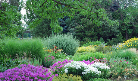
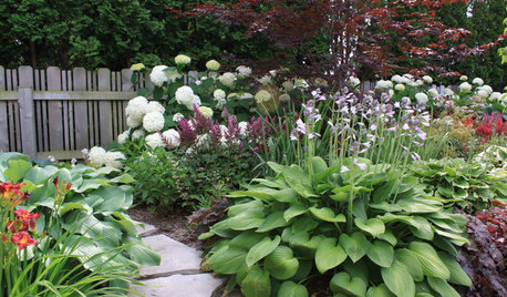
LANDSCAPE DESIGNTake Your Garden on a Rural Route With Plant-Dominant Designs
Let plants take center stage for a garden that recalls idyllic pastures fashioned by nature's hand
Full Story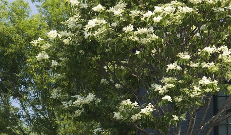
GARDENING GUIDESNo-Regret Plants: 5 Questions Smart Shoppers Ask
Quit wasting money and time at the garden center. This checklist will ensure that the plants you're eyeing will stick around in your yard
Full Story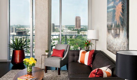
DECORATING GUIDESMission Possible: A Designer Decorates a Blank Apartment in 4 Days
Four days and $10,000 take an apartment from bare to all-there. Get the designer's daily play-by-play
Full StorySponsored
Central Ohio's Trusted Home Remodeler Specializing in Kitchens & Baths
More Discussions


EricaBraun
zkathy z7a NC
Related Professionals
Baltimore Landscape Architects & Landscape Designers · Willowick Landscape Architects & Landscape Designers · Amesbury Landscape Contractors · Brandon Landscape Contractors · Darien Landscape Contractors · Mission Bend Landscape Contractors · Rockland Landscape Contractors · Norridge Landscape Contractors · Palm Desert Driveway Installation & Maintenance · Brooklyn Park Fence Contractors · Clarksburg Fence Contractors · Palo Alto Fence Contractors · Rockville Fence Contractors · Wallingford Fence Contractors · Los Angeles Solar Energy SystemsJosh Spece
almosthooked zone5
cottonwood468
sandyslopes z5 n. UT
esther_bOriginal Author
DelawareDonna
hostatakeover swMO
don_in_colorado
old_dirt 6a