


Colour
inkognito
16 years ago
Sort by:Oldest
Comments (27)
Related Stories
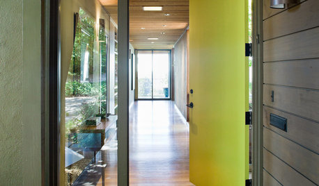
CURB APPEAL5 Bright Palettes for Front Doors
Splash bold green, blue, orange or red on your front door, then balance it with a more restrained hue on the rest of the house
Full Story
DECORATING GUIDESNo Neutral Ground? Why the Color Camps Are So Opinionated
Can't we all just get along when it comes to color versus neutrals?
Full Story
COLORColors of the Year: Look Back and Ahead for New Color Inspiration
See which color trends from 2014 are sticking, which ones struck out and which colors we’ll be watching for next year
Full Story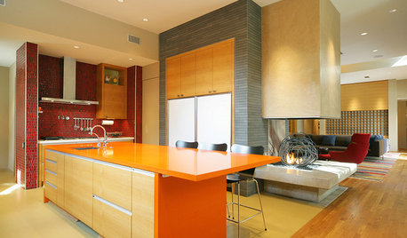
KITCHEN DESIGNPalatable Palettes: 8 Great Kitchen Color Schemes
Warm and appetizing or cool and relaxing? These 8 paint palettes can help you choose the best colors for your kitchen
Full Story
COLORColor of the Year: Off-White Is On Trend for 2016
See why four paint brands have chosen a shade of white as their hot hue for the new year
Full Story
COLORBest Uses for the Boho Blue Color of 2015
PPG Pittsburgh Paints’ Color of the Year is a bold bohemian blue best used in small doses
Full Story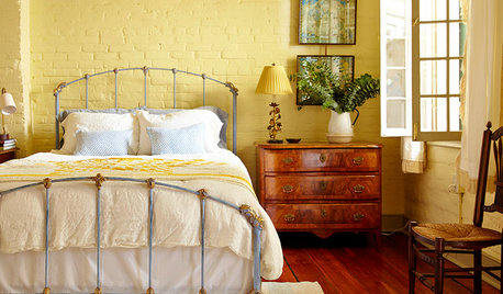
COLORSet the Mood: 4 Colors for a Cozy Bedroom
Look to warm hues for that snuggle-friendly feeling
Full Story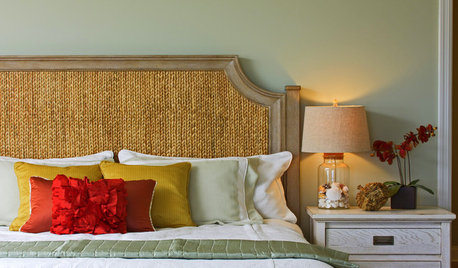
COLORHow to Add Color if You’re Color Shy
Here’s how to break into the world of color without breaking a sweat
Full Story
COLORBest Uses for the Saturated Blue Color of 2015
Kelly-Moore’s selection is a classic shade of blue worthy of chunky accents around the home
Full Story
COLORHow to Use Marsala, Pantone’s 2015 Color of the Year
Pantone digs deep and goes earthy with its selection. Here are ways to make it work in your home
Full Story
laag
Jando_1
Related Professionals
Saint Matthews Landscape Architects & Landscape Designers · Canyon Lake Landscape Contractors · Fort Payne Landscape Contractors · Hicksville Landscape Contractors · Newnan Landscape Contractors · Peachtree City Landscape Contractors · North Hills Landscape Contractors · Cincinnati Decks, Patios & Outdoor Enclosures · Crystal Lake Decks, Patios & Outdoor Enclosures · Foothill Farms Decks, Patios & Outdoor Enclosures · Green Bay Decks, Patios & Outdoor Enclosures · Hull Decks, Patios & Outdoor Enclosures · Quincy Decks, Patios & Outdoor Enclosures · Towson Decks, Patios & Outdoor Enclosures · Troy Decks, Patios & Outdoor EnclosuresinkognitoOriginal Author
fuzei
yojimbo
inkognitoOriginal Author
stevega
bonsai_audge
yojimbo
bonsai_audge
stevega
bonsai_audge
laag
fuzei
laag
fuzei
laag
fuzei
laag
fuzei
fuzei
Jando_1
laag
fuzei
laag
fuzei
stevega