


New format
NHBabs z4b-5a NH
11 years ago
Sort by:Oldest
Comments (34)
Related Stories
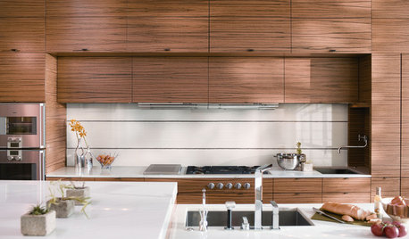
KITCHEN DESIGNNew Tile Styles for the Kitchen
Large-format, mosaic, metallic, and wood tile designs will be darlings of showrooms and trade shows this year
Full Story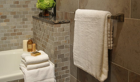
BATHROOM DESIGNBath Style: Ready to Try a Larger Tile?
Large-Format Rectangular Tiles GIve a Bathroom a Fresh New Look
Full Story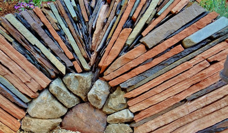
LANDSCAPE DESIGNFollow Nature’s Lead for Artful Stacked Stones
Surprise and delight in the landscape with rock formations resembling wildland hoodoos and cairns
Full Story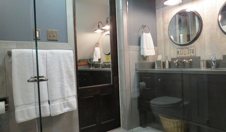
BATHROOM DESIGNSee the Clever Tricks That Opened Up This Master Bathroom
A recessed toilet paper holder and cabinets, diagonal large-format tiles, frameless glass and more helped maximize every inch of the space
Full Story
DECORATING GUIDESHow to Save a Boring Box of a Room
Whip a ho-hum format and low ceilings into high-design shape with these ideas that offer a big new vision
Full Story
REMODELING GUIDESTop 10 Tips for Choosing Shower Tile
Slip resistance, curves and even the mineral content of your water all affect which tile is best for your shower
Full Story
MOST POPULAR102 Eye-Popping Powder Rooms
Flip through our collection of beautiful powder rooms on Houzz and fill your eyes with color and style
Full Story
DECORATING GUIDESLook-Alikes That Save Money Without Skimping on Style
Whether in woodwork, flooring, wall treatments or tile, you can get a luxe effect while spending less
Full Story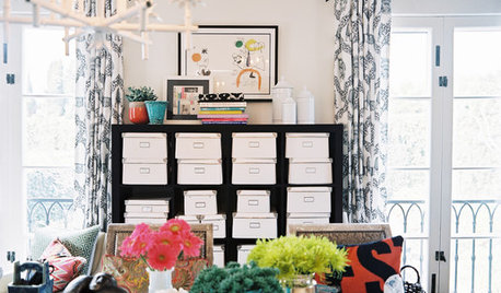
HOME OFFICESOrganize Photos in a Flash
You post them, email them, maybe even print them out. But if your digital and printed photos are all lumped together, it's time to organize
Full Story
ACCESSORIESGeology 101: A Craving for Coral-Inspired Design
This underwater beauty has inspired many interior designs. Here are 4 exciting and eco-friendly ways to use coral in your home
Full StoryMore Discussions

molie
mad_gallica (z5 Eastern NY)
Related Professionals
Windham Landscape Architects & Landscape Designers · Pelham Landscape Contractors · Bedford Heights Landscape Contractors · Brookline Landscape Contractors · Gresham Landscape Contractors · Mendota Heights Landscape Contractors · Petaluma Landscape Contractors · Pleasant Prairie Landscape Contractors · Salem Landscape Contractors · Northlake Landscape Contractors · Palos Heights Landscape Contractors · Canton Decks, Patios & Outdoor Enclosures · Commerce City Decks, Patios & Outdoor Enclosures · Fredonia Decks, Patios & Outdoor Enclosures · Little Rock Decks, Patios & Outdoor Enclosuresspedigrees z4VT
corunum z6 CT
NHBabs z4b-5a NHOriginal Author
diggerdee zone 6 CT
diggingthedirt
pixie_lou
spedigrees z4VT
prairiemoon2 z6b MA
prairiemoon2 z6b MA
bill_ri_z6b
diggingthedirt
diggerdee zone 6 CT
spedigrees z4VT
molie
prairiemoon2 z6b MA
diggerdee zone 6 CT
mad_gallica (z5 Eastern NY)
diggerdee zone 6 CT
corunum z6 CT
spedigrees z4VT
prairiemoon2 z6b MA
prairiemoon2 z6b MA
mad_gallica (z5 Eastern NY)
molie
prairiemoon2 z6b MA
prairiemoon2 z6b MA
prairiemoon2 z6b MA
molie
mad_gallica (z5 Eastern NY)
kpaquette
jenniferg76
NHBabs z4b-5a NHOriginal Author