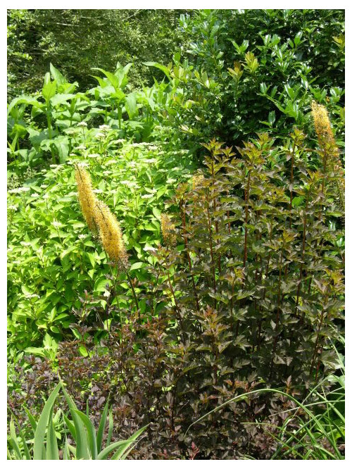
Shop Products
Houzz Logo Print
runktrun

Gruesome Groupings

runktrun
13 years ago

Yes I know taste is subjective but letÂs be honest the right plant growing in the wrong place can be downright ugly. This photo below from my garden of Physocarpus ÂSeaward is a bronze eye sore in a sea of green that only serves to point out how ugly bronze can be in the wrong place. Actually the only thing I can think of that would make this shrub have a purposeful position in this garden would be if I repeated this plant throughout the bed but even then I canÂt think how multiple Physocrpus would tie together successfully with the other plantings.

Last year when I decided I didnÂt really like the Physocarpus where it was planted I made the same mistake I made when I brought home a sofa that was beautiful in the store and hideous in my living room, I tried to hide it with throw pillows. In this case the pillows in the garden are Eremurus bungei fox tail lily a pretty flower in its own right but grouped with this Physocarpus just makes the scene even worse.

Have you seen or grown any of your own gruesome groupings?

Comments (16)

  • bill_ri_z6b
    13 years ago

    Katy,
    I'm not so sure it's the bronze color as much as the similarity of the foliage to most of the other things around it. If it were, for instance, a lacy bronze leaf, or a large, round leaf, or a compound fern-like leaf or a sword shaped leaf etc. I don't think it would look bad at all!

    I have planted some things that didn't look right where they were, and I've either moved them or tossed them out. It's an ongoing bout with creativity isn't it?

    Bill

  • cloud_9
    13 years ago

    I like those two together - when you move it, move them both, K? Thanks!
    : D

  • WendyB 5A/MA
    13 years ago

    hang in there... I recall last fall I was absolutely loving the fall color of Summer Wine. Mine is in a good amount of sun and as I recall it was so red and gorgeous for so long, I was thrilled to have it. Yours looks pretty sunny too.

    THe spring with more purplish color is pretty nice too. I bet you weren't gruesome then. Its those summer blahs that does it in.

  • WendyB 5A/MA
    13 years ago

    Here's one I call the Big Clash! I guess I forgot about the orange-red tulips that would be coming up when I planted the pansies.

    And as if that wasn't bad enough, the other side of the driveway, which can sorta be in the same view, has early blooming Cornell Pink azaleas. They are bright pure pink.

    I won't be keeping this picture public for long so if you only get a red x sometime in the future, you know why - LOL!

  • Marie Tulin
    13 years ago

    Ah, Wendy,

  • prairiemoon2 z6b MA
    13 years ago

    Wendy, don't feel bad, I had a similar bad combination this year. I have Penstemon 'Iron Maiden' which is orange and I planted it with purple Nepeta and salvias, but 2 Rudbeckia 'Indian Summer' volunteered in between the two, it was horrid. lol I finally couldn't take it and pulled the Rudbeckia. I find orange is the hardest color to fit into the garden.

  • Penelope
    13 years ago

    For years I had lilac/purple rhododendrons that bloomed at the same time as Campbells-tomato-soup-red azaleas. Bleah! I finally pulled out the azaleas and replaced them with white.

  • rockman50
    13 years ago

    I love the pairing of orange tiger lilies with brilliant blue hydrangeas. I have seen a number of yards in Falmouth (Cape Cod) over the last few weeks with this combination, and it really seems to work. As an aside, the blue hydrangeas appear to be particularly spectacular this year. Has anybody else noticed that? I wished I had one.

  • diggingthedirt
    13 years ago

    Yes, I like ditch lilies with blue mopheads, too. One combo I hate, which I have - different hydrangeas planted together. I love a mass of a single variety, but when different styles/different blues are combined, the result is just boring, and they seem to detract from each other. Too soon old and too late wise, as my mother says - and she's very wise.

    Wendy, you get a medal for bravery! I've slaughtered many otherwise good combos by introducing a color that's completely wrong, but I've never photographed it! And if I had, I would have deleted the shot, not posted it.

    I like orange; like Rockman, I think it's great with blue, but I especially like it with or reds and/or deep purples. With pastels, not so much.

  • WendyB 5A/MA
    13 years ago

    Ha! I probably photographed it to remind me to correct it for the following year. That was taken several years ago.

    The few Endless Summer blooms I have are a gorgeous shadeof blue this year. I was attributing it to last year's perfect application of aluminum sulfate. Guess can't take credit for that either.

    I LOVE orange in the garden. I have a red-yellow-orange bed with touches of purple that is wonderful.

    Unfortunately, a pink echinicea just showed up this year in that bed. It was planted several years ago before the red-yellow-orange switchover and never bloomed (one of those fancy shmancy new varieties that was a bust). I think I will cut the flowers and bring them in the house in a vase. Or shall I take a gruesome picture first - LOL ?

  • diggerdee zone 6 CT
    13 years ago

    I don't have too many gruesome groupings in my garden, mostly because I only ever plant pink and purple bloomers, lol, with a few yellows and even fewer whites thrown in!

    I have come to like orange the last few years, and have been adding it to my garden, but I keep it strictly separated from my usual pastels. I have a new bed to hold the oranges, along with yellows and the one or two reds I'm trying to add (not a big red fan).

    I will say one day I was cutting some zinnias and happened to put orange ones in the bucket with hot pink - and it really looked great! I haven't gone so far as to plant that color combination in my garden, but I do like it in the vase.

    Wendy, your photo reminds me of a friend's garden. She just plops whatever's on sale at the local drugstore (yes, drugstore - or maybe they call it a health and beauty aid store nowadays, lol) into her garden, into her pots, etc., and it's just horrid to me. Not that your photo looks horrid, lol, but it's just that my friend's mumble-jumble of blooms looks very jarring to my eye.

    Oh, I do have a spot I just remembered. I had WSown some rudbeckia - I think something like Cherokee Sunset or Autumn Colors, a rudbeckia with dark browns/rusts/reddish oranges, and I had no where to plant them so I plopped them "temporarily" in my pastel garden. Ugh! They are in bloom now and I am reminded that I MUST move them!

    :)
    Dee

  • runktrun
    Original Author
    13 years ago

    Orange with pastels can be a funny thing sometimes I love it such as in the photo below (another conservancy garden photo)and other times it is just simply gruesome. Why do you think it works here?? Or do you think all of my taste is in my mouth and it is gruesome in this grouping as well??

    While I was reading your responses I was reminded how dangerous it can be to discuss gruesome groupings with other gardeners. This spring I read a comment from ginny about how much she disliked Pieris 'Moutain Fire' planted near her cherry tree as the Pieris is covered in new red growth at the same time as the pastel pink cherry blossoms abound. After reading that I remembered I planted P 'Mountain Fire' nearby my cherry and for other reasons neither one will ever be moved I now I need to plant something else in that area that will either distract the eye from the gruesome mess or some how have those colors together make sense. I wonder though if I hadn't read ginny's comments how long if ever it would have taken me to notice how bad the two together are.

  • WendyB 5A/MA
    13 years ago

    I'm not a fan of that orange with those pinks in the above photo. I can see a dark purple there. But I agree with the hot pink and orange combo looking good. Isn't that dunkin donuts logo colors?

    When I complained to my neighbor-gardener about my tulips & pansies, she thought it looked great. I hope she was just being polite.

    Another bad combo is lilacs and japanese maple red new growth.

  • bill_ri_z6b
    13 years ago

    I like vibrant colors in the garden. I have seen and appreciate the cottage gardens in England, and although many of them favor pastels and the pink/purple/blue/white palette, I have also seen many that have a bit of yellow, orange and/or red that really pops. ".....in the eye of the beholder."

    In my travels out west, I've seen lots of wildflowers throughout the mountain, forest and desert regions, and generally mother nature uses all the colors of the rainbow. It seems to work well there. The deserts are often filled with bright colors, as are the mountain meadows. Cacti and yuccas, Indian paintbrush and lupines and wild irises and roses as well as black-eyed susan and so many others. They look amazing!

    I think you should plant what YOU like where YOU like it, and that's what your garden should be. Not dictated by what others think or what's fashionable, or what some "expert" in a garden magazine or forum gives as his opinion. It's to be enjoyed by the gardener. Isn't that why we garden? For enjoyment?

  • spedigrees z4VT
    13 years ago

    I love bright vivid colors as well, Bill, and to my eye there are no bright colors that clash. Reds, bright pink, fuschia, orange, purple, and golden yellow all mixed together look lovely to me.

    Pastel flowers (not my thing) on the other hand seem to need a lot of care with regard to neighboring blooms or else they just don't "look right."

  • ontheteam
    13 years ago

    I love any plant that blooms no matter where it is lol...

    shrug... I do not have a look or style or pallet, I just plant stuff I like in what ever place it will do best. IT will have to make its own peace with the neighbors lol..