


BLA - the exciting sequel!
bonsai_audge
17 years ago
Sort by:Oldest
Comments (37)
Related Stories
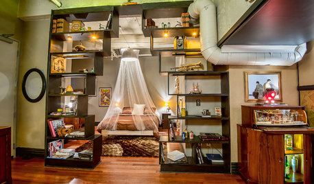
LOFTSHouzz Tour: A Bachelor Pad’s Part II
A designer has a hand in two phases of this movie director’s life and his loft in a landmark Art Deco building in L.A.
Full Story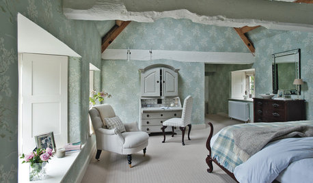
TRADITIONAL HOMESHouzz Tour: Historic Manor House Regains Its Country Style
A neglected 11th-century property is restored to its former glory as a traditional family home
Full Story
SHOP HOUZZShop Houzz: A Mother’s Day Makeover From Ashton, With Love
Get the look with worn woods, pale neutrals and eclectic Western accessories
Full Story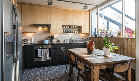
KITCHEN DESIGNA Two-Tone Cabinet Scheme Gives Your Kitchen the Best of Both Worlds
Waffling between paint and stain or dark and light? Here’s how to mix and match colors and materials
Full Story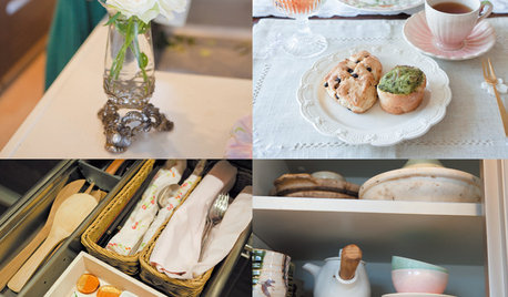
ORGANIZING‘Tidying Up’ Author Marie Kondo Tells How to ‘Spark Joy’ at Home
A new book from the author of ‘The Life-Changing Magic of Tidying Up’ delves deeper into her KonMari Method of decluttering and organizing
Full Story
COLORDreaming in Color: 8 Gorgeous Gray Bedrooms
With this versatile hue, you can go dark and bold or slip into something more soothing
Full Story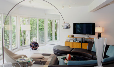
HOUZZ TOURSMy Houzz: Mod Chic for a Midcentury Riverfront Home
White walls and floors set off gorgeous river views and brightly colored furnishings in a 1950s Ohio home
Full StorySponsored
bonsai_audgeOriginal Author
bonsai_audgeOriginal Author
Related Professionals
Allen Landscape Architects & Landscape Designers · Brentwood Landscape Architects & Landscape Designers · Gainesville Landscape Contractors · Blue Springs Landscape Contractors · Camp Verde Landscape Contractors · Clayton Landscape Contractors · Kettering Landscape Contractors · Mastic Beach Landscape Contractors · Pleasant Grove Landscape Contractors · Pomona Landscape Contractors · San Rafael Landscape Contractors · Shoreview Landscape Contractors · Lauderdale Lakes Landscape Contractors · Easton Driveway Installation & Maintenance · Pawtucket Driveway Installation & Maintenancebonsai_audgeOriginal Author
nandina
Cady
bonsai_audgeOriginal Author
Cady
Cady
inkognito
Cady
inkognito
Cady
bonsai_audgeOriginal Author
bonsai_audgeOriginal Author
Cady
bonsai_audgeOriginal Author
laag
bonsai_audgeOriginal Author
nandina
bonsai_audgeOriginal Author
nandina
bonsai_audgeOriginal Author
inkognito
bonsai_audgeOriginal Author
Cady
bonsai_audgeOriginal Author
miss_rumphius_rules
bonsai_audgeOriginal Author
Cady
miss_rumphius_rules
bonsai_audgeOriginal Author
bonsai_audgeOriginal Author
Cady
bonsai_audgeOriginal Author
Cady
bonsai_audgeOriginal Author
laag