


WEBSITEs for nurseries -- tell me about yours!
sweetpea_path
19 years ago
Related Stories

KITCHEN DESIGNHouzz Call: Tell Us About Your First Kitchen
Great or godforsaken? Ragtag or refined? We want to hear about your younger self’s cooking space
Full Story
FUN HOUZZHouzz Call: Tell Us About Your Dream House
Let your home fantasy loose — the sky's the limit, and we want to hear all about it
Full Story
VALENTINE’S DAYTell Us: Why Did You Fall in Love With Your House?
What was it about your house that made your heart flutter? Share your photo, and it could make the Houzz homepage
Full Story
FEEL-GOOD HOMEGuys Tell Us About Their Favorite Places at Home
For Father’s Day, Houzz men show us the places in their homes where they like to hang out
Full Story
INSIDE HOUZZTell Us Your Houzz Success Story
Have you used the site to connect with professionals, browse photos and more to make your project run smoother? We want to hear your story
Full Story
REMODELING GUIDESWhat to Know About Budgeting for Your Home Remodel
Plan early and be realistic to pull off a home construction project smoothly
Full Story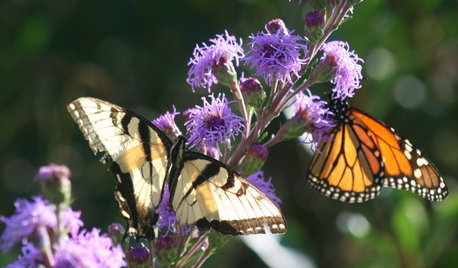
FALL GARDENINGWhat Monarch Butterflies Taught Me About Garden Design
Thinking like a butterfly leads to fresh perspectives in the garden and in life
Full Story
LIFEGive Your Home a History by Telling Your Story
Share your family's epic saga — or even just kiddie doodles — for a home that's personal, meaningful and inspiring
Full Story
PETSSo You're Thinking About Getting a Dog
Prepare yourself for the realities of training, cost and the impact that lovable pooch might have on your house
Full Story
LIFETell Us: Do You Know How to Live With Your Parents?
If you've tried multigenerational living under one roof, we'd love to hear the details
Full Story
mich_in_zonal_denial
honeybunny442
Related Professionals
Canton Landscape Architects & Landscape Designers · Elwood Landscape Architects & Landscape Designers · South Orange Landscape Architects & Landscape Designers · Billerica Landscape Contractors · Burlington Landscape Contractors · Cedar Hill Landscape Contractors · Choctaw Landscape Contractors · Elkridge Landscape Contractors · Holtsville Landscape Contractors · Las Vegas Landscape Contractors · Lyndhurst Landscape Contractors · Palatine Landscape Contractors · Peoria Landscape Contractors · Vermilion Landscape Contractors · Whitehall Landscape Contractorsbonsai_audge
honeybunny442
vouts