


New look for GW - Issue?
Julia WV (6b)
11 years ago
Sort by:Oldest
Comments (17)
Related Stories
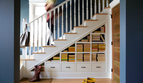
ORGANIZINGPre-Storage Checklist: 10 Questions to Ask Yourself Before You Store
Wait, stop. Do you really need to keep that item you’re about to put into storage?
Full Story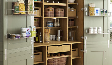
KITCHEN PANTRIES80 Pretty and Practical Kitchen Pantries
This collection of kitchen pantries covers a wide range of sizes, styles and budgets
Full Story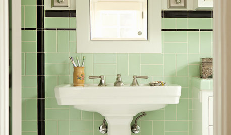
BATHROOM DESIGN9 Surprising Considerations for a Bathroom Remodel
Don't even pick up a paint chip before you take these bathroom remodel aspects into account
Full Story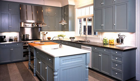
KITCHEN DESIGNHow to Work With a Kitchen Designer
If you're ready to make your dream kitchen a reality, hiring a pro can ease the process. Here are the keys to a successful partnership
Full Story
LIFEHow Do You Make Your Tea and Coffee in the Morning?
A morning cup is a must for many, and preparation comes in many guises. We look at coffee and tea habits across the Houzz community
Full Story
LIGHTINGHouzz Tour: An Indian High-Rise Trips the Light Fantastic
Surreal colored lighting and an ubercontemporary design make an apartment near Mumbai dance with drama
Full Story
SMALL HOMESHouzz Tour: Color and Personality in 500 Square Feet
This Los Angeles home for 4 has a small footprint, but the family is big on creative solutions and styling
Full Story
ECLECTIC STYLEDesign Talk: Eclectic vs. Collected
12 Ways To Master the Mix-and-Match Style
Full Story
Replace Your Windows and Save Money — a How-to Guide
Reduce drafts to lower heating bills by swapping out old panes for new, in this DIY project for handy homeowners
Full Story

floota
gmatx zone 6
Related Professionals
Camas Landscape Architects & Landscape Designers · Norwood Landscape Contractors · Dudley Landscape Contractors · Hollywood Landscape Contractors · Mercedes Landscape Contractors · Milford Landscape Contractors · Oviedo Landscape Contractors · Peachtree City Landscape Contractors · Rosemount Landscape Contractors · Hueytown Landscape Contractors · Burlington General Contractors · Erlanger General Contractors · Keene General Contractors · Rossmoor General Contractors · Wallington General ContractorsJulia WV (6b)Original Author
Julia WV (6b)Original Author
organic_kitten
silverkelt
lisa_3
flowergirl929
jean_ar
dementieva
Julia WV (6b)Original Author
organic_kitten
floota
Julia WV (6b)Original Author
jean_ar
dementieva
Julia WV (6b)Original Author